CSS Grid (Part 16A) — CSS Grid Alignment + Centering
Positioning content inside grid items
Live dev notes taken throughout the CSS Grid course by Wesbos — cssgrid.io
While you might not need to use CSS Grid all the time, or even if the grid itself is only 1 column wide — it is pretty useful to be able to align and centre in CSS.
There are 6 properties that come with CSS Grid to help us do this, but we will look into the first two in part 1:
Part 1
justify-itemsalign-items
Part 2
justify-contentalign-contentalign-selfjustify-self
To remember which ones to use:
justify-*is row / x axisalign-*is column / y axis
Let’s explore these properties.
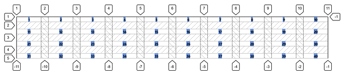
Create a collection of 40 items with a class of itm and itm# so that the base CSS doesn’t affect our understanding.
<div class="container">
    <div class="itm itm1">1</div>
    <div class="itm itm2">2</div>
    <div class="itm itm3">3</div>
    <div class="itm itm4">4</div>
    <div class="itm itm5">5</div>
    <div class="itm itm6">6</div>
    <div class="itm itm7">7</div>
    ...
    <div class="itm itm40">40</div>
</div>
We’ll give them spacing of 20px with an even distribution of 10 columns:
.container {
    display: grid;
    grid-gap: 20px;
    grid-template-columns: repeat(10, 1fr);
}
Which looks a bit more clearer with the guides on.

Let’s also add some colour to know what we’re looking at.
.itm {
    background: cornflowerblue;
}
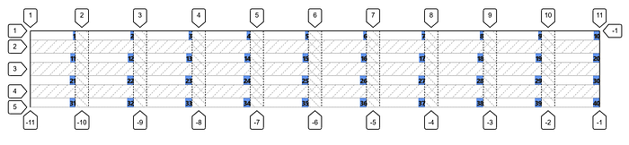
1 — justify-items (x-axis)
1.1 — stretch (default)
.container {
    display: grid;
    grid-gap: 20px;
    grid-template-columns: repeat(10, 1fr);
    justify-items: stretch;
}
By default, justify-items has a value of stretch
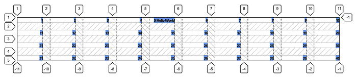
1.2 — centre
.container {
    display: grid;
    grid-gap: 20px;
    grid-template-columns: repeat(10, 1fr);
    justify-items: centre;
}
The items are only as wide as the content inside it.
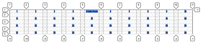
If we extended the text, it would stretch the row’s height to fit.
1.3— start
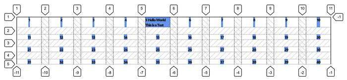
Similarly we have justify-items: start which will move the content to the start of the grid item and only stretch to the content rather than the width of the column.
.container {
    display: grid;
    grid-gap: 20px;
    grid-template-columns: repeat(10, 1fr);
    justify-items: start;
}
1.4 — end
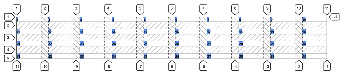
Contrastingly, we can apply justify-items: end which will position the items to the right of the grid cell.
.container {
    display: grid;
    grid-gap: 20px;
    grid-template-columns: repeat(10, 1fr);
    justify-items: end;
}
2 — align-items (y axis)
2.1 — start
.container {
    display: grid;
    grid-gap: 20px;
    grid-template-columns: repeat(10, 1fr);
    justify-items: end;
    align-items: start;
}
Nothing would happen when there’s no height to the rows.
.container {
    display: grid;
    grid-gap: 20px;
    grid-template-columns: repeat(10, 1fr);
    grid-template-rows: repeat(5, 100px);
    justify-items: end;
    align-items: start;
}
But once we add a height value to each of the rows, the content is now kept at the top.
2.2 — end
.container {
    display: grid;
    grid-gap: 20px;
    grid-template-columns: repeat(10, 1fr);
    grid-template-rows: repeat(5, 100px);
    justify-items: end;
    align-items: end;
}
Drops the content to the bottom of each row.
2.3 — center
.container {
    display: grid;
    grid-gap: 20px;
    grid-template-columns: repeat(10, 1fr);
    grid-template-rows: repeat(5, 100px);
    justify-items: end;
    align-items: center;
}
Moves them up to the centre vertically, but since we justified the items to the end, it’ll stay on the right.
2.4 — stretch (default)
.container {
    display: grid;
    grid-gap: 20px;
    grid-template-columns: repeat(10, 1fr);
    grid-template-rows: repeat(5, 100px);
    justify-items: end;
    align-items: stretch;
}
Stretches the content all the way across from top to bottom.

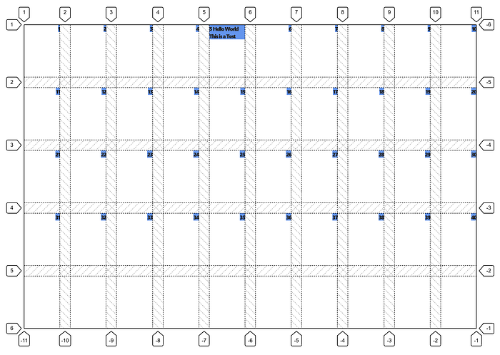
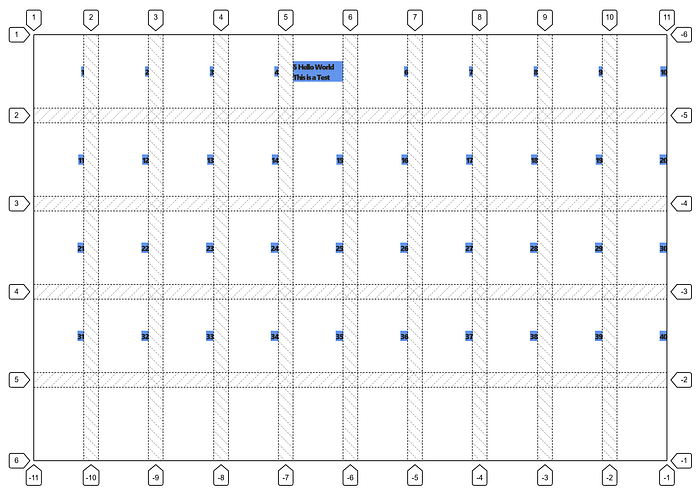
If we want to centre the content right in the middle of each grid cell, both justify-items and align-items will have a value of centre
.container {
    display: grid;
    grid-gap: 20px;
    grid-template-columns: repeat(10, 1fr);
    grid-template-rows: repeat(5, 100px);
    justify-items: center;
    align-items: center;
}
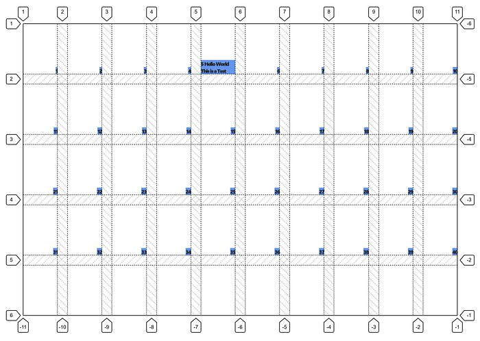
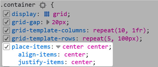
Alternatively, there is a shorthand we can also use to declare the same thing:
.container {
    display: grid;
    grid-gap: 20px;
    grid-template-columns: repeat(10, 1fr);
    grid-template-rows: repeat(5, 100px);
    place-items: center center;
}
place-items does the exact same thing.
Further Reading
Nifty article by CSS Tricks:
https://css-tricks.com/snippets/css/complete-guide-grid/

